


Information architecture and motion design for a physician education hub addressing health disparities
Agency: Toolhouse

Background
Hepatitis B is a deadly and underdiagnosed disease that disproportionately affects some minority and immigrant populations. HepBMD.com is an educational hub to bring awareness to healthcare providers serving patients from those communities. It was full of useful information, statistics, and disease awareness information, but data showed a high bounce rate and a low page visit per session. The content was unnecessarily hidden, and there was excessive use of navigation to access the content. In close collaboration, my content strategy partner and I conducted a complete site redesign, information architecture, and content re-write process.
A Content audit and card sorting exercise
We began with a content audit, including content from outside the existing site. We identified some common categories of content, and with the guidance of the Account Director and Director of Digital Strategy, we conducted a card sorting exercise to establish the information architecture and site map.

A mobile-first approach to wireframes
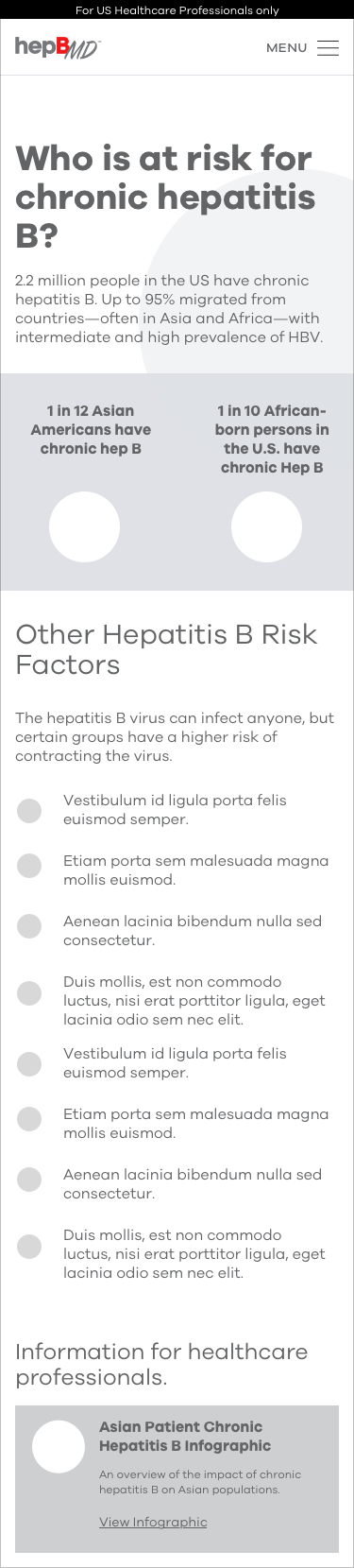
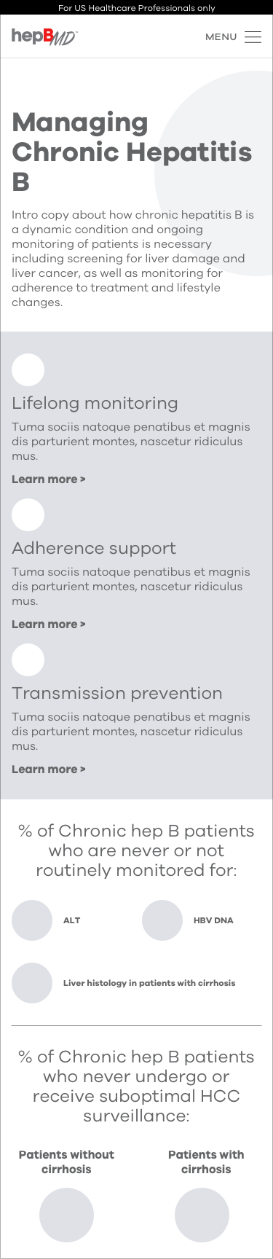
Once the client approved the site map, I got to work creating detailed wireframes of the existing content, while the content strategist created scannable, clear headlines.
To follow best practices, and especially due to the dense nature of the content, we opted for a mobile-first approach to illustrate to the client how we created an experience that can be easily consumed and skimmed even on a mobile device.


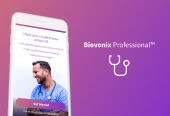
Creating a visual language that puts the patient in center frame
There were few design constraints besides an established logo and color scheme. For that reason, I chose to explore mood boards to get both internal and client feedback on a look and feel that would capture healthcare providers' attention and place their vulnerable patients at the top of their minds.
While both mood options were well received, the team and the client chose option A. We wanted the healthcare provider to potentially recognize an active patient who may be at risk and overlooked. Because the nature of the portraits evoked a more personal and direct representation of the patient, option A was chosen.


Visuals that frame the patient who needs to be recognized
With client-approved wire frames and a visual aesthetic established with mood boards, I began applying the visual design to the content and establishing some data visualization patterns.
"In collaboration with the content strategist, we created the concept of the animated 'red box,' which is drawn over the patient photo as the page loads. I worked closely with the engineer to find a technical approach that made this animation possible. The goal: draw the healthcare provider's attention to the idea that the patient who needs to be screened for Hepatitis B could be sitting right in front of them."


Results
Post-launch analytics showed significant improvement in bounce rate and pages per session—users were staying longer and exploring more content.
More importantly, the redesign reframed how healthcare providers encounter this information. Dense clinical data became scannable. The animated red box created an emotional moment of recognition. And vulnerable patient populations—often overlooked—were placed at the center of the experience.
Work contributed
- User experience strategy
- User experience design
- Visual design
- Motion direction
- Information Architecture
- Brand Design