Flyweight: a new brand, new voice, and new digital persona for this boutique agency.
Agency: Carnes Media
Background
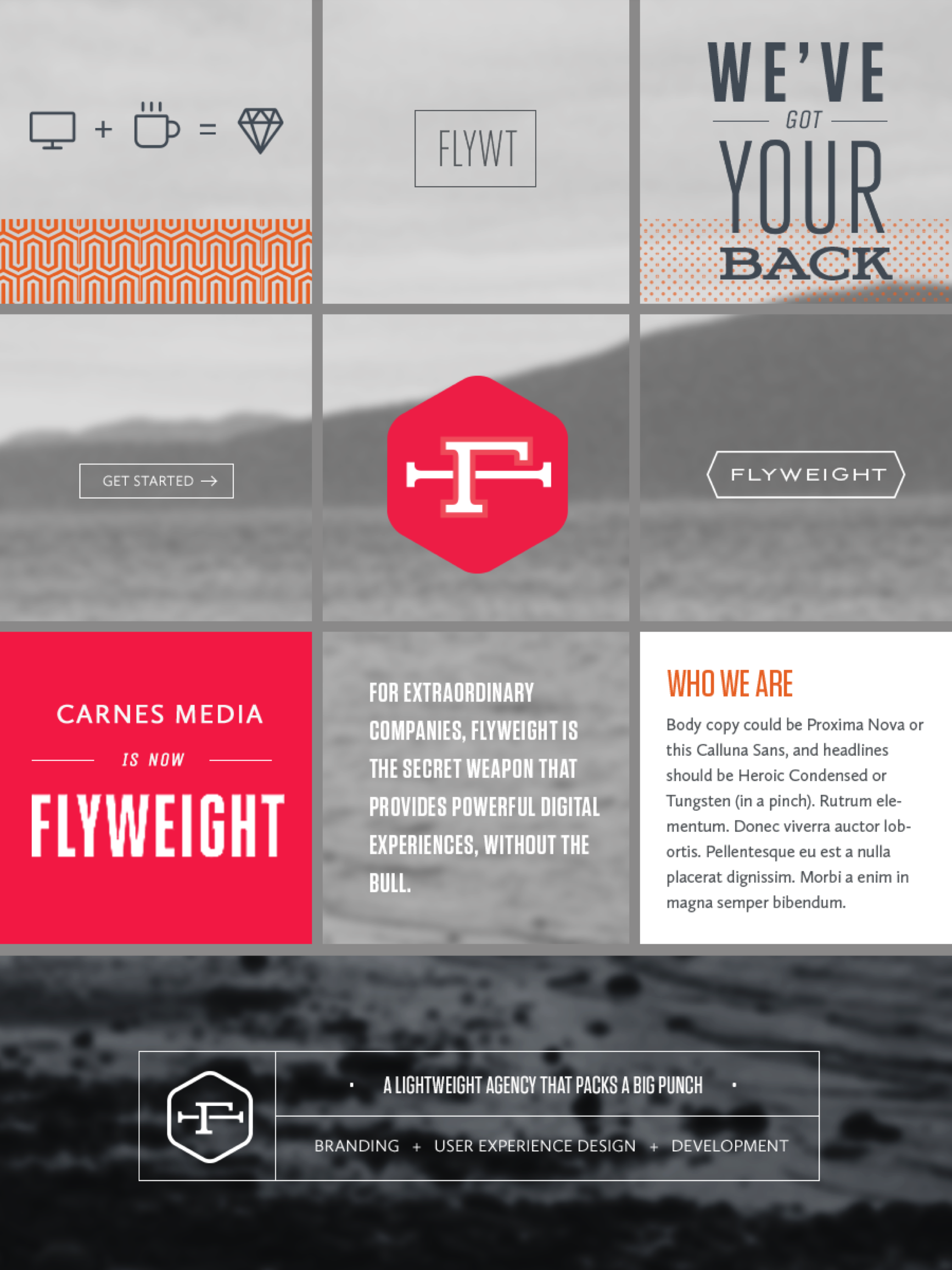
Carnes Media was a small agency of creatives and developers that managed to land some big projects, and were able to deliver big agency quality in less time. We wanted more work like that, but like the cobbler’s children with no shoes, we had neglected our own brand and web presence. Over the course of a few months, as the lead brand and visual designer, I led the team in a series of naming and brand strategy workshops, which informed a complete rebrand and redesign of our website.
Choosing a name
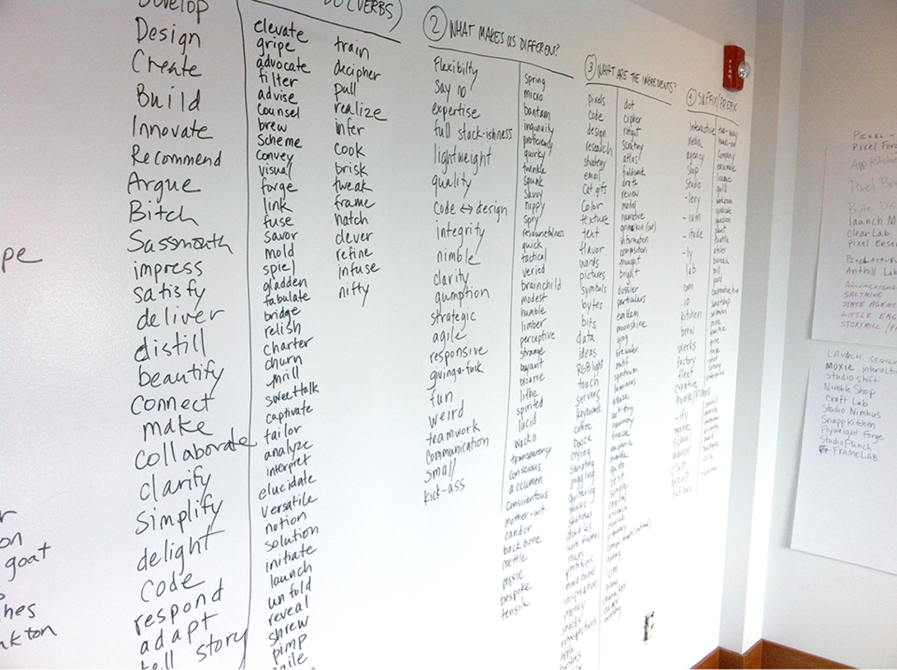
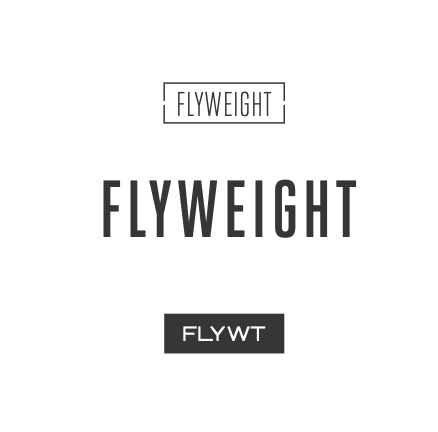
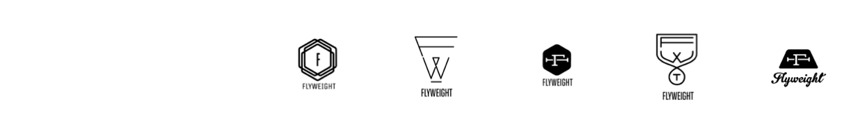
We wanted a name that captured what we heard from our clients: a small agency that packed a big punch. After leading the team in a series of concept and word generating exercises we gathered all our ideas and narrowed the name down to a few options. After some heated debate and some colored sticky dots, we landed on Flyweight–a small fighter whose slight form is a competitive advantage.
Competitive analysis
Working closely with the content strategist, I explored the business models and marketing strategies of our competitors. Then we went about creating a brand statement to inform the creative that would become the brand’s look, voice and tone.

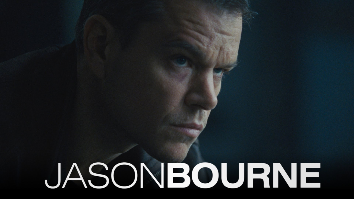
Flyweight Brand Persona: Jason Bourne
We used the persona of Jason Bourne, from the Bourne Supremacy movies, to inform the voice and tone of the brand’s visuals and language. Jason is a nice guy but you don’t want to mess with him. He’s got serious skills, and he’ll get the job done before you even know he’s there.
Mood boards and language to form the brand story
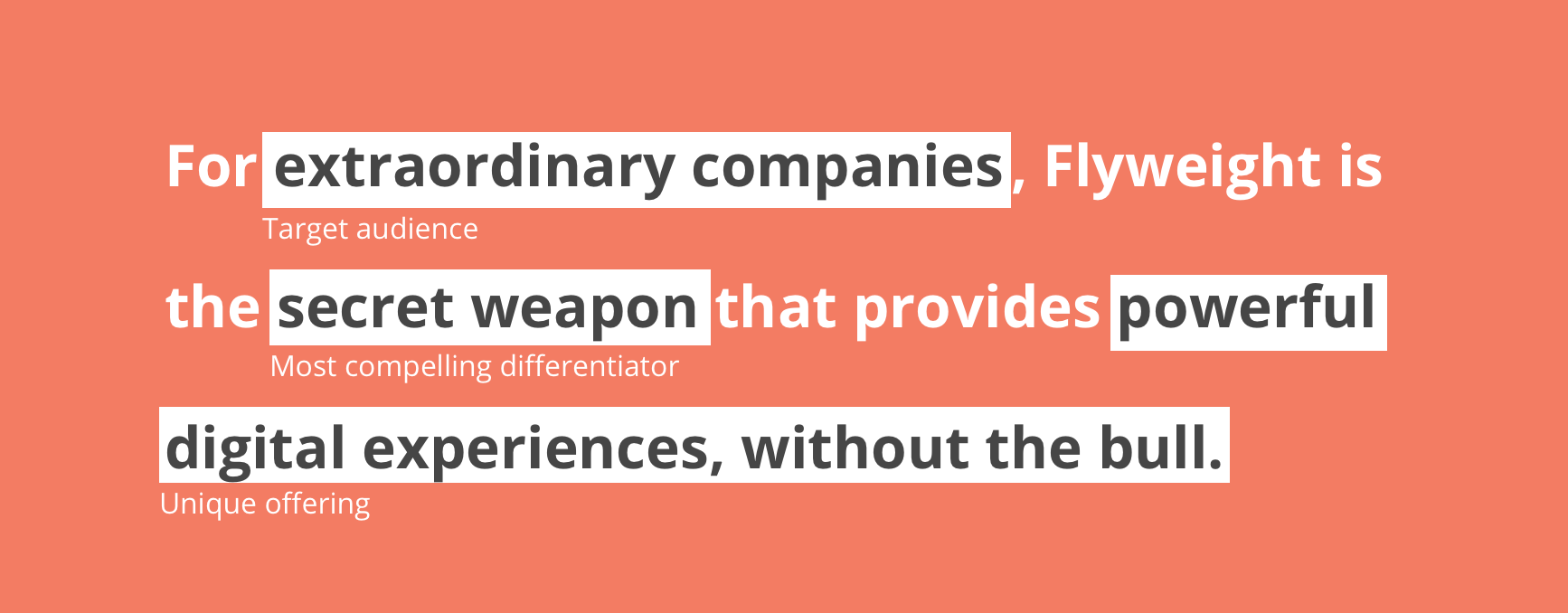
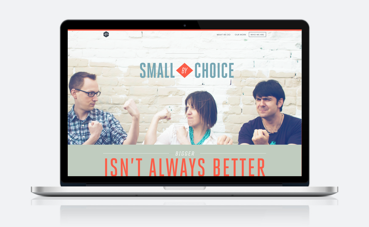
Drawing on the “secret weapon” nature of the brand persona, I explored several visual styles for the Flyweight Brand, including explorations of tag-lines and voice and tone. The team landed on a look that employed a clean layout and use of white space, while evoking the use of midcentury-inspired typography that you might find on an vintage ad for a boxing match.
Identity and Logo Design
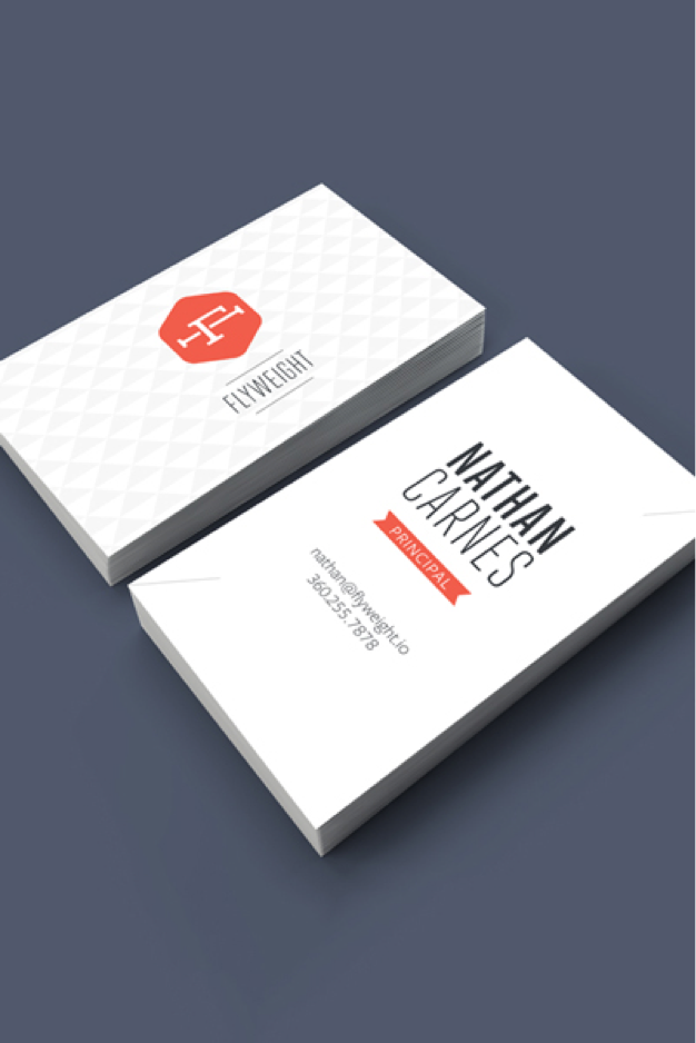
Considering the brand statement and persona, I engaged in a series of logo explorations from sketches to digital mockups. The team finally landed on the simple wordmark and badge that were designed to be used independently or in a lockup together.
Website Wireframes
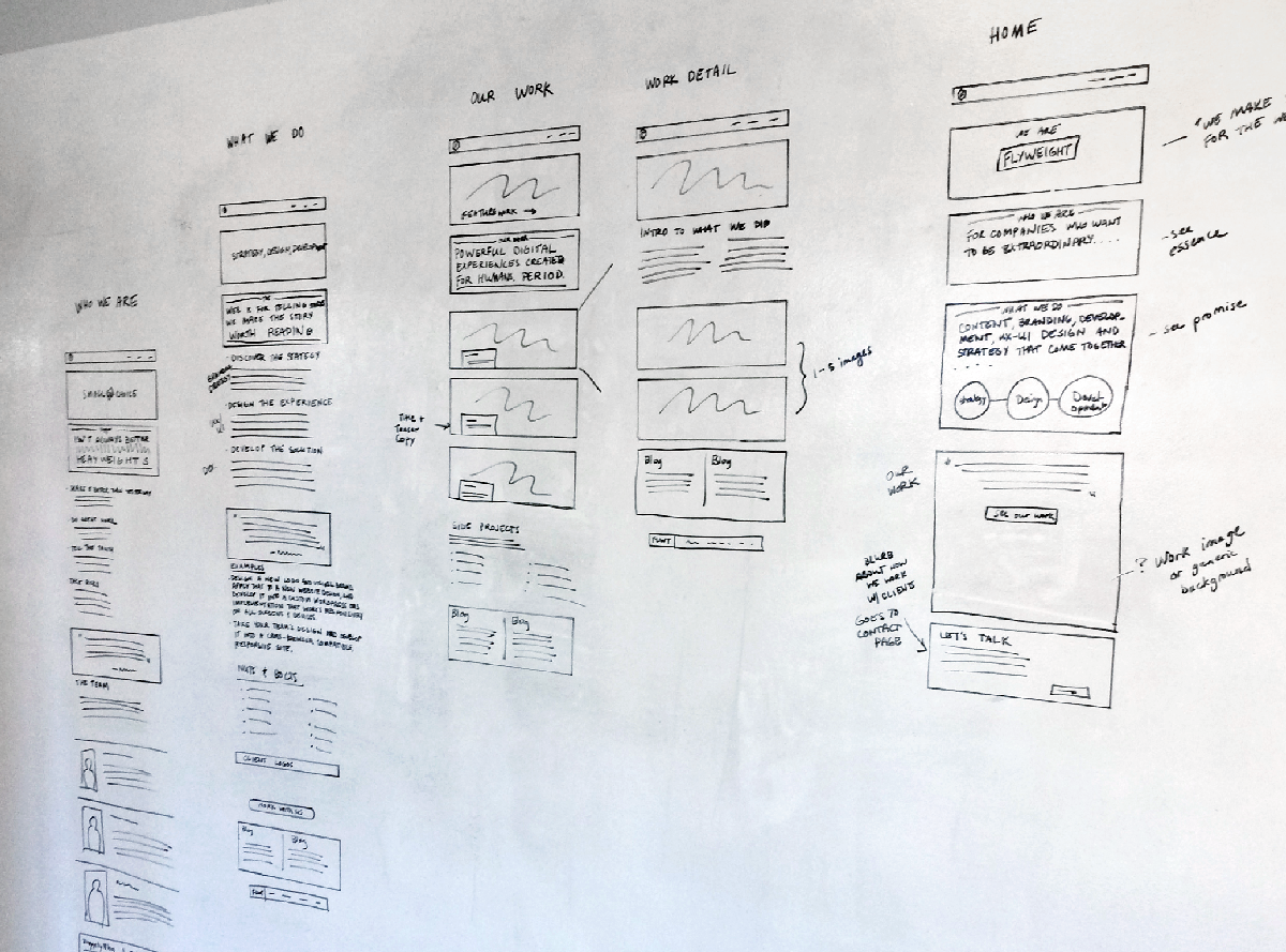
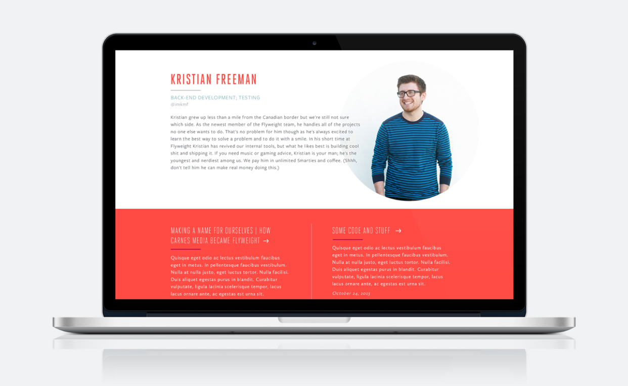
Collaborating closely again with the content strategist, we created loose wireframes to structure the content of our new website, including biographies of the staff, and deep case studies of each pieces of work we featured on the site.
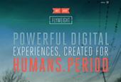
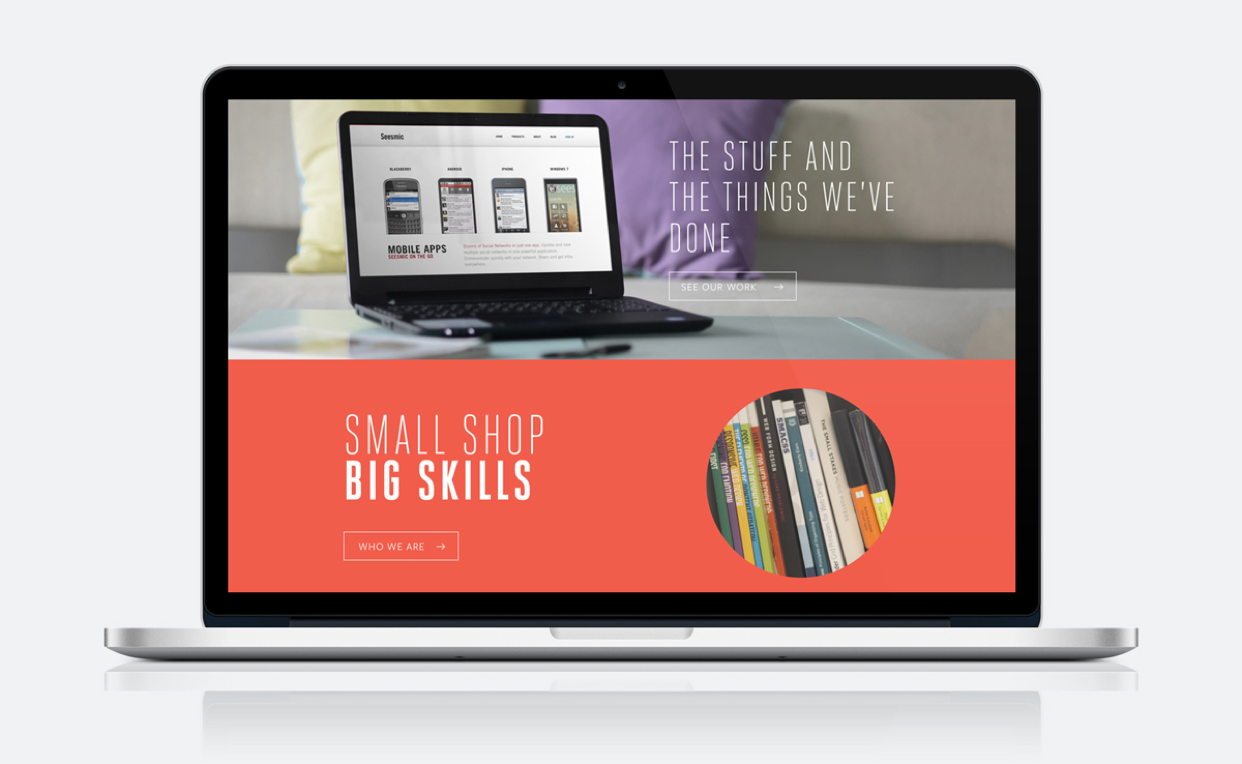
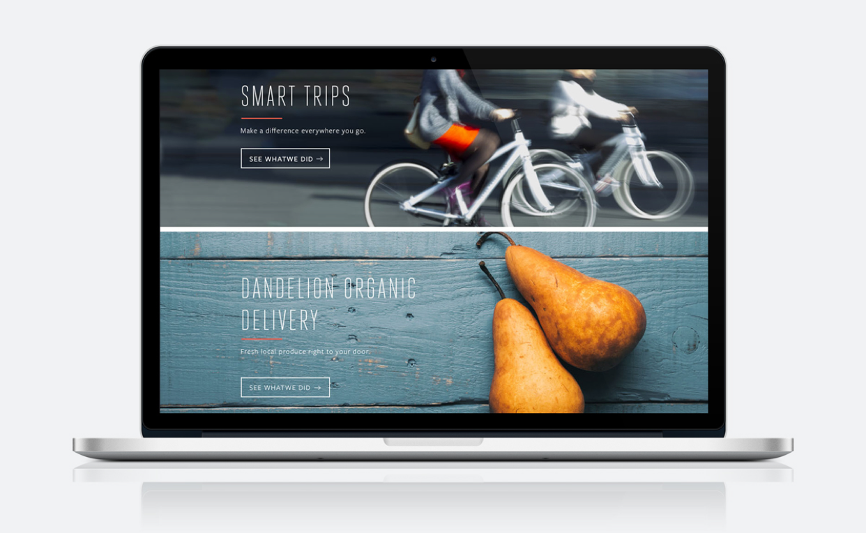
Final Visual Design
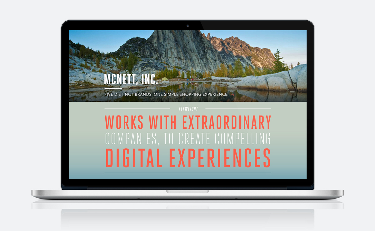
Working off of the wireframes and manuscript provided by the content strategist, I designed the website pages with the intention of putting the work front and center and coded a custom WordPress theme to launch the Flyweight website.
A brand that means business
After months of leading workshops, analysis and brainstorming exercises, and after countless logo and mood board explorations, I tied the bow on the Flyweight brand and web design project. The Flyweight team, formerly Carnes Media, finally had a name, identity, and web presence that let future clients know who we were, and just what we were capable of.
Work Contributed
Brand strategy
Naming strategy
Logo design & identity
Information architecture
- User Experience Design
- Website design
- Front-end web development
- Custom Responsive WordPress theme