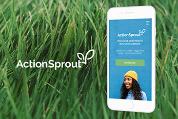
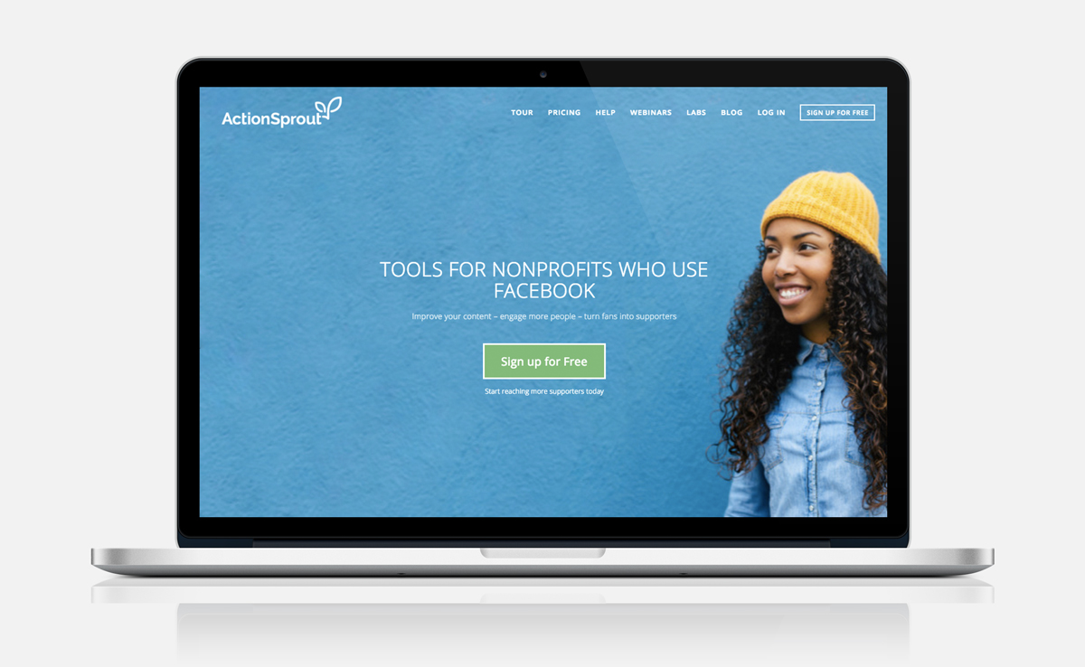
ActionSprout is a startup that makes social media tools for the nonprofit sector.
Scaling User Engagement
Big brands spend millions on social media every year, and our feeds are filled with their messages. What if causes could harness the same power to mobilize supporters? ActionSprout was created to help the nonprofit sector engage with their audiences on Facebook just as corporate brands do. From increasing page engagement, analyzing and replicating successful content, to harnessing the power of data to understand and mobilize supporters. After gaining a few thousand users to the initial product, it was time to scale user engagement. As the Lead Product Designer, I collaborated with the Co-Founder and the Product Manager to scale the product and grow user engagement.
Redesigning the UI and navigation from the ground up.
The first step was to improve usability through a consistent UI system. I worked in collaboration with the Product Manager and the Co-founder to create a design system and visual aesthetic based loosely on Google’s open-source design system Material Design.

Getting to know the users:
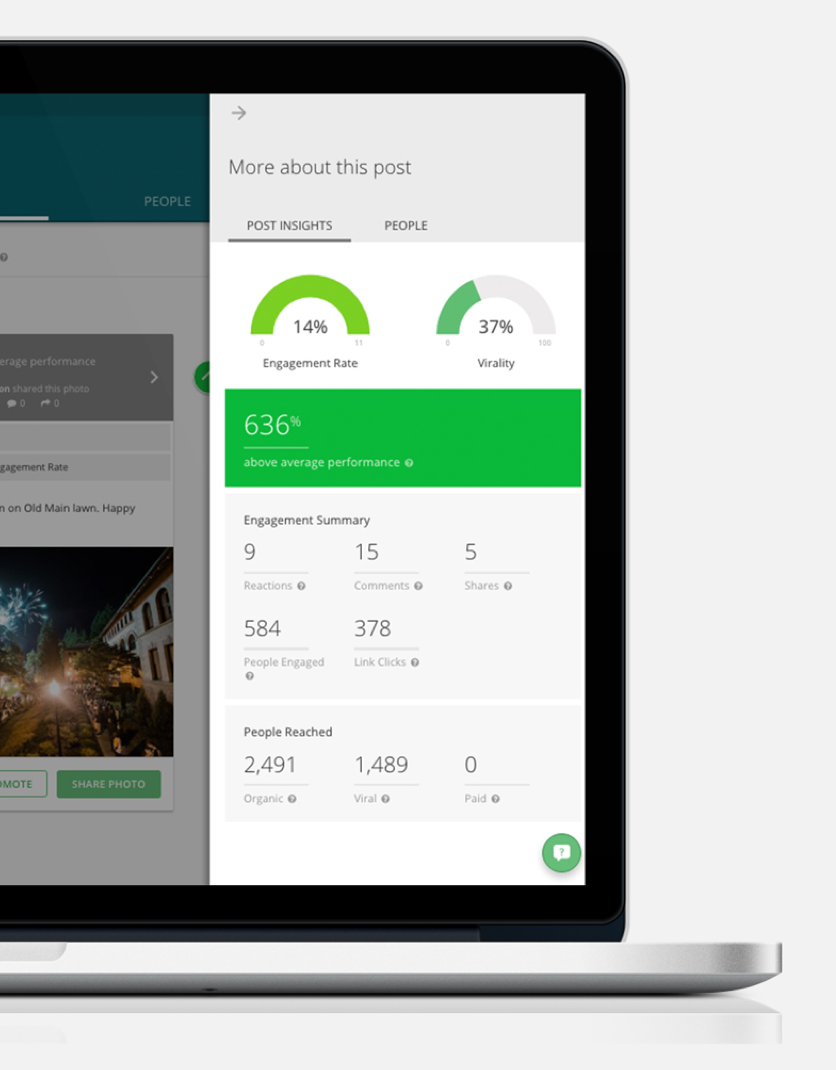
User interviews and data revealed that users lacked a clear motivation for using ActionSprout. Through observing app data, user session activity, heat maps, and reports from Customer Success, it was evident that user engagement dropped off soon after sign-up.
Users reported a high interest in the app, but confusion about why they needed these particular tools to be successful.
They also reported hesitation to allow ActionSprout to manage their Facebook page, in order to use the app.


UX Strategy 1: Engage the user through onboarding.
In order to educate and show the value and utility of the app, I created an onboarding experience that allowed the user to engage with a feature and learn more about it before signing up.
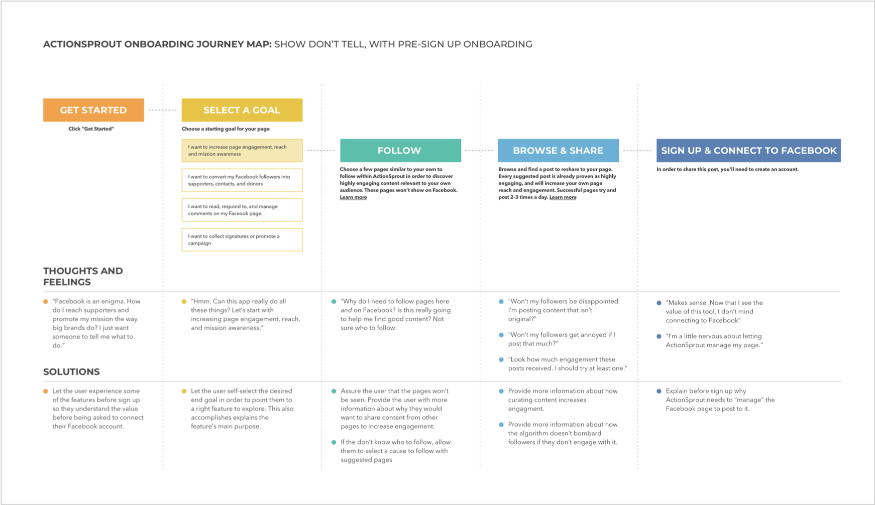
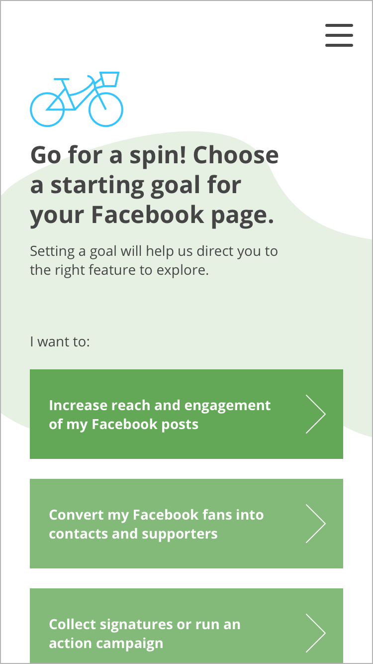
Educate and build trust with low risk steps to get started, catered to the goals of the user.
By providing a preset list of Facebook page goals, the app is able to educate the user about the value the app can provide before they even interact with it.
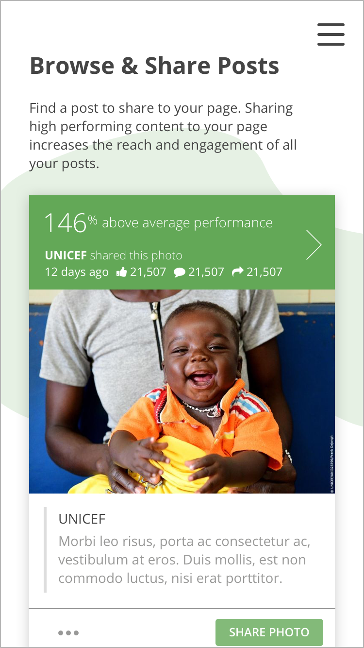
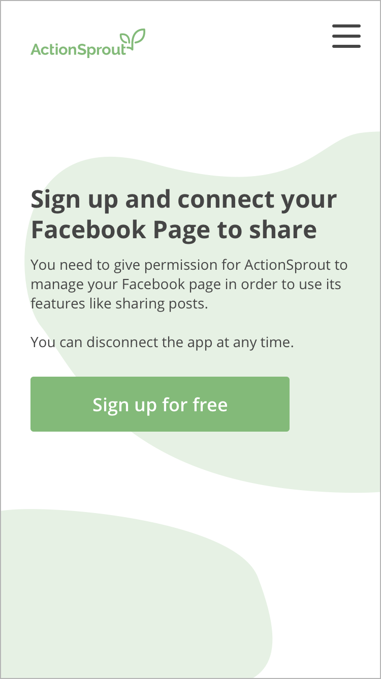
Once the user chooses a goal, I take them through a series of low-risk starting steps which allows them to experience the app and its powerful features. Once they arrive at sign up, they have a better understanding of the value and utility of the app, and will be more inclined to provide permission.

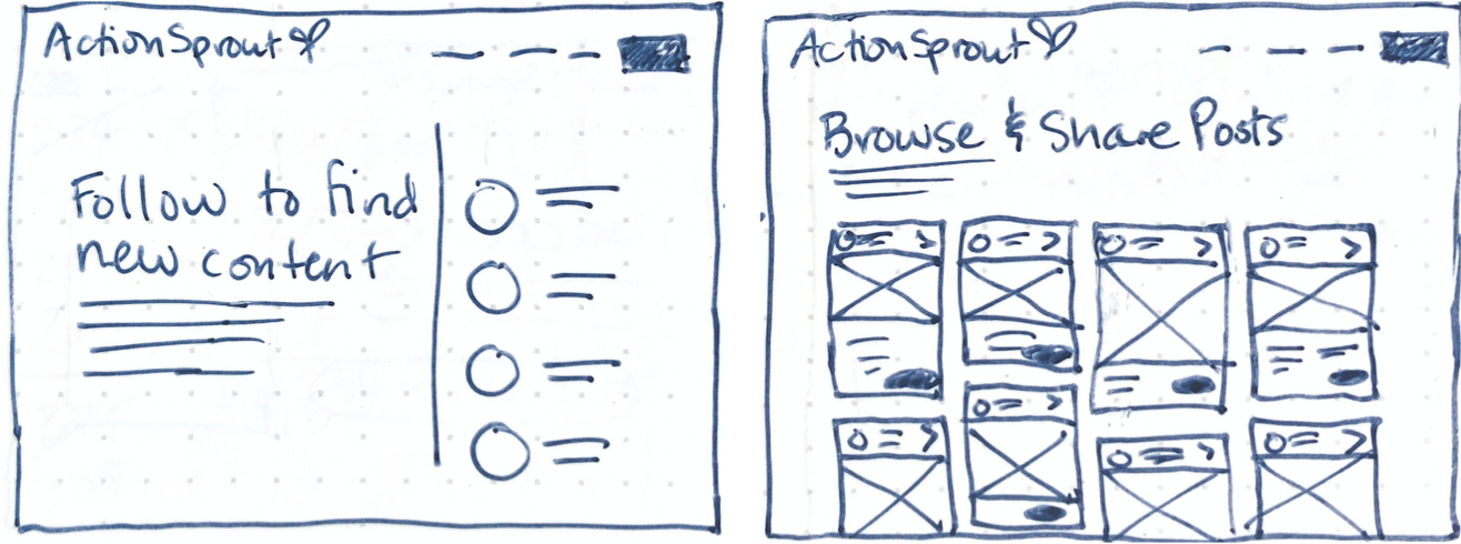
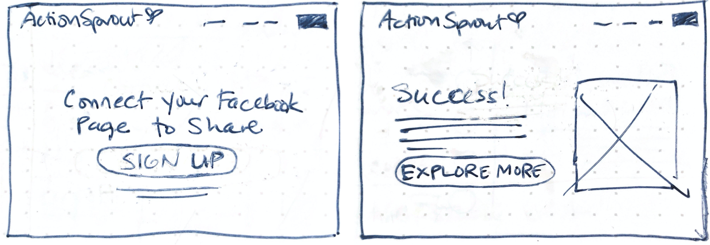
Next step: translate sketches to wireframes and designs
Working off of the user journey map and loose sketches, I created an interaction that educates the user on the value of the product first, then takes them through a real interaction inside the app. Using a friendly visual style and conversational writing voice, I reinforced the idea that the app was helpful and trustworthy. When they are finally comfortable enough to share a post from the app, only then do we ask for sign up and permission to access their Facebook page.


UX Strategy 2: Educate users about effective social media marketing inside and outside the app.
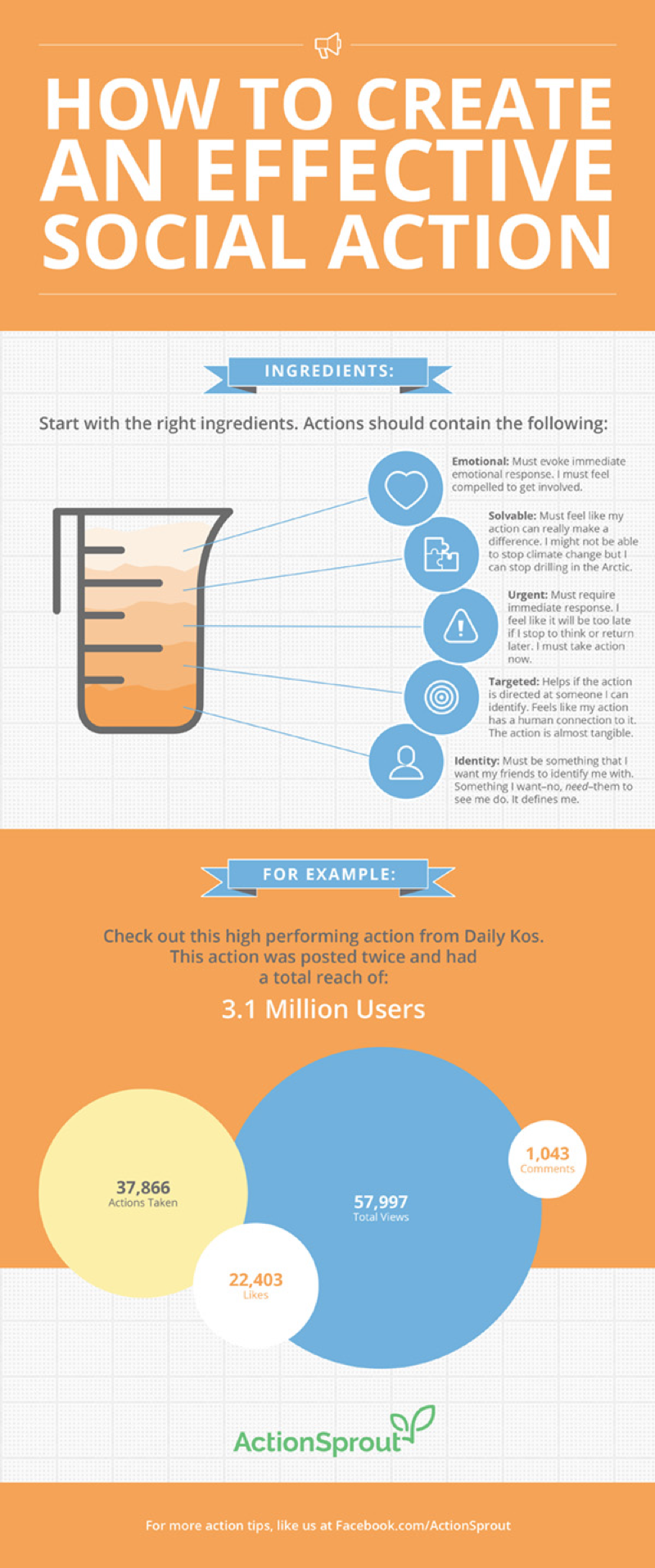
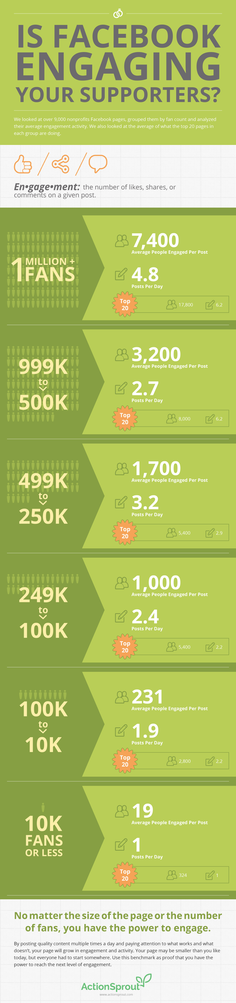
In collaboration with the Customer Success Lead, we created a variety of educational tools to help non-profit Facebook pages including infographics, and in-app informational tooltips.
A strategic design vision
Through a collaborative process with the entire team, and using both qualitative and quantitative research, I executed a new logo and brand, information architecture, interaction library and improved onboarding experience that provided the foundation for the team to scale the product and serve the non-profit community on Facebook.
Work Contributed
User experience design
User interface design
Information architecture
User research
Brand strategy
Logo design & identity
- Website design
- Marketing and advertising design
- Front-end web development